We blink today in 2025, and in my later 40's, and the weeks and even months pass right by. In so many parts of life we look at photos or videos and realize now and again that those months really did pass right by.
Still, though, progress continues on the Onondaga Cutoff. One of the hobby's best characteristics is that there is always something more to do, something to chip away at that will allow progress to continue.

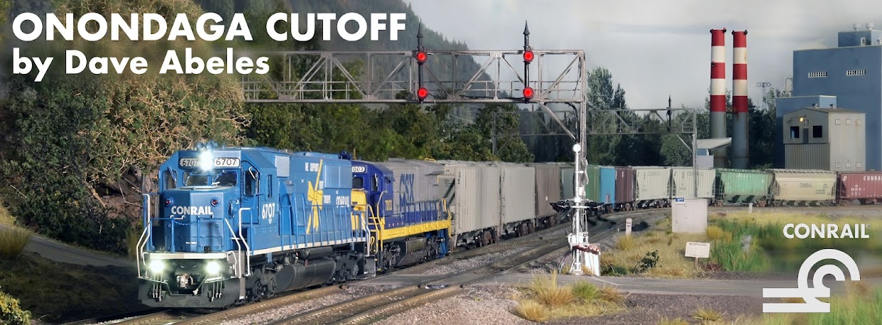
First, allow me one more post to just remark on how nice it is to see such beautiful models of 'Big Dash-7s' on the OC. Through the 80's and '90's, the Albany Division was loaded with these locomotives, and these C36-7's especially roamed not only from Selkirk but also systemwide. So you can't call a railroad the Chicago Line without them - and now here they are. Amazing!

Just beautiful. Those that follow my Patreon channel ( https://www.patreon.com/onondagacutoff ) are familiar with the improvements I did with the number boards, and aside from that I am simply thrilled with these models out of the box. Someday, when there are also a bunch of C30-7A models (6550-6599) we will be all set.
With the number board improvements completed, it was time to do a batch weathering of the new fleet, so I jumped into that quickly to get the series in service ahead of an operation session just before Thanksgiving 2025.

They followed my usual procedures - details first, then masking, then panel liners and dullcoat. These got a second layer of dullcoat as seen here, then got an overspray with a fade coat and grit coat on the underframes before final applications of pastel chalks and paint details.

Here's three friendly faces, ready to join the 6621 in regular service. Now, clearly to have seen four of the 25 total in one spot would be unlikely in Conrail days, but not impossible. But what is a guy to do when one of the two most critical locomotives is offered commercially as a pre-order for limited production?
Yep. Get 'em all.
I'll be paying for it for a while but this is the right thing for the roster now, like it will be again when the C30-7A is available.
These are great problems to have!
Best wishes to you all and I hope your Thanksgiving was great.


